HTML5绘制饼图实例(二)
本文接上一讲继续来说明
我们继续来制作饼图示例,结合CSS3。先说一下需求,就是一个展示的页面,用饼图来展示数据,下方给出各个扇形的含义,最后给一个按钮点击进入详情。饼图的上方有标题和简单的文字介绍,这些内容竖式结构,页面上显示散列,就是这么简单。
我们首先来设置背景样式,用CSS3的渐变,那么首先页面代码需要先修改,我们一步一步来,首先看下HTML代码:
<!DOCTYPE html><html><head> <meta charset="UTF-8" /> <title>HTML5 Canvas Demo</title><style type="text/css">body{margin:0px;padding:0px;}.bg{ position:absolute; height:100%; width:100%;overflow-x: hidden;overflow-y:hidden; background-image: -moz-linear-gradient(top,#77D1F6, #2F368F); background-image:-webkit-gradient(linear, left top, left bottom, color-stop(0, #77D1F6),color-stop(1, #2F368F));}</style></head><body></html>这样,我们就得到了一个渐变的背景,并且对webkit内核和moz内核的浏览器都可用,同时设置没有滚动条。好,下面来设置显示的区域,加入渐变,那么我们将HTML代码修改如下:
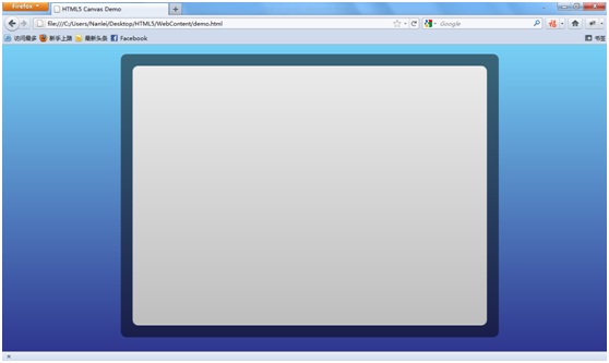
<div name="code">.panelBg{ position:absolute; height:600px; width:800px; left:250px; top:20px; border-radius: 12px; background-color:#000000; opacity:0.5;}因为我们要做层次的效果,且层间不能干扰,我们使用了绝对定位,同时设置属性,这里还加入了圆角矩形的设置,圆角半径为12px,最后设置渐变效果opacity为0.5,那么效果大家自己去看,我们继续来做:
<div name="code">.panel{ position:absolute; height:550px; width:750px; left:275px; top:45px; border-radius: 12px; background-image: -moz-linear-gradient(top,#EBEBEB, #BFBFBF); background-image: -webkit-gradient(linear, left top, left bottom, color-stop(0, #EBEBEB),color-stop(1, #BFBFBF));}也是用了渐变的背景,然后设置长宽和位置,加上圆角矩形,根据外层背景的长和宽,我们预留的渐变边框为25px,那么内层的各个属性我们也不难算出来,那么我们就得到了现在的效果:
底板基本都做好了,我们就开始往里面填充内容吧,首先是HTML:
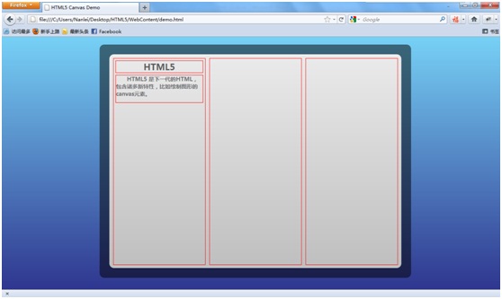
<div name="code">#section1{ border:1px solid red; position:relative; float:left; width:235px; height:530px; top:10px; left:10px;}#section2{ border:1px solid red; position:relative; float:left; width:235px; height:530px; top:10px; left:20px;}#section3{border:1px solid red; position:relative; float:left; width:235px; height:530px; top:10px; left:30px;}这里我留下了border属性,就是为了测试时定位用的,那么现在我们得到了这样的效果:

下面就是对这三块中的内容进行填充了,我们讲解一块,其它三个都是类似的,很简单,首先我们设置标题title和副标题subTitle:,放到section1中:
<div id="section1"><div name="code">.title{ border:1px solid red; position:relative; margin:5px; font-family:微软雅黑; font-size:22px; font-weight:bold; text-align:center; color:#58595B;}.subTitle{ border:1px solid red; margin:5px; font-family:微软雅黑; font-size:14px;height:70px; font-weight:bold;text-indent:2em; color:#6D6E71;}现在的效果为:
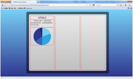
接下来我们要放置配置饼图的canvas了,绘制饼图的方法之前说过,就是一段JavaScript代码,我们只需要留出位置即可:
<div id="section1"><div width="225" height="168"></canvas></div></div>
下面就是确定样式和绘制饼图了,只需调整圆心位置即可,将data数组放于方法内,我们要设置三组data值,而color就是一组:
.piechart{ border:1px solid red; margin:5px; height:170px;}<script type="text/javascript">var color = ["#27255F","#2F368F","#3666B0","#2CA8E0","#77D1F6"];function drawCircle(){var data = [5,30,15,30,20];var canvas = document.getElementById("piechart1");var ctx = canvas.getContext("2d");var startPoint= 1.5 * Math.PI;for(var i=0;i<data.length;i++){ctx.fillStyle = color[i];ctx.strokeStyle = color[i];ctx.beginPath();ctx.moveTo(112,84);ctx.arc(112,84,84,startPoint,startPoint-Math.PI*2*(data[i]/100),true);ctx.fill();ctx.stroke();startPoint -= Math.PI*2*(data[i]/100);}}drawCircle();</script>我们来看看绘制好饼图后的效果:
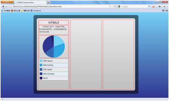
下面放置对饼图的介绍,也很简单,我们来看一下,将下面的代码放置到piechart的div下面:
<div style="background-color: rgb(119, 209, 246); "></div><div style="background-color: rgb(44, 168, 224); "></div><div style="background-color: rgb(54, 102, 176); "></div><div style="background-color: rgb(47, 54, 143); "></div><div style="background-color: rgb(39, 37, 95); "></div><div name="code">.description{ border:1px solid #CCCCCC; border-color: #636263 #464647 #A1A3A5; margin:10px 5px; height:165px; border-radius: 4px;}.scroll-item {position: relative;width: 100%;height: 32px;border-bottom:1px solid gray;cursor: pointer;}.item-even {background-color: #E7E8EC;}.item-odd {background-color: #E0ECF6;}.rect {float: left;margin-top: 5px;margin-left: 5px;width: 20px;height: 20px;border-radius: 3px;}.item-text{margin-left: 5px;height: 100%;float: left;font-size: 14px;font-family: 微软雅黑;vertical-align: middle;display: inline-block;line-height: 30px;}其中没什么可多说的,就是设置了一下奇偶行的不同颜色,因为我们都是定死的,所以就这么来做了,比较简单,剩下就是设置长宽,圆角的样式了,不是很难,现在我们得到了这样的效果:
还有最后的一个按钮了,也很简单了,我们如下设置,接着上面的代码,编写:
<div name="code">.button{ border:1px solid #cccccc; cursor:pointer; margin:10px 5px; height:40px; text-align:center; border-radius: 4px; border-color: #636263 #464647 #A1A3A5; text-shadow: 0 1px 1px #F6F6F6; background-image: -moz-linear-gradient(center top, #D9D9D9, #A6A6A6 49%, #A6A6A6 50%); background-image: -webkit-gradient(linear, left top, left bottom, color-stop(0, #D9D9D9),color-stop(1, #A6A6A6));}.buttonText{ position:relative; font-weight:bold; top:10px; font-family:微软雅黑; color:#58595B;}现在我们就完成了一组了,得到如下的效果:

比葫芦画瓢完成剩下两组,也很简单了,最后我们得到:
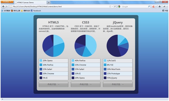
那么,这个例子也就做完了,主要是介绍利用Canvas绘制饼图,然后结合CSS制作一个小demo,用于数据展示用,对浏览器要求比较高,而且基本排除了IE,暂时也就不太适合普通应用,在特定浏览器的应用中(比如ipad中的safari等)使用较好。
至此,本部分就介绍完了。欢迎交流,希望对使用者有用。更多精彩内容,稍后为您呈现。