Supporting Multiple Screens 翻译 支持各种屏幕(上)
?
For simplicity, Android groups all actual screen densities into four generalized densities: low, medium, high, and extra high.
屏幕一个物理区域上像素点的总数,通常被称作dpi(每英寸的像素点数)。例如,一个低密度屏幕比正常密度和高密度屏幕在给定的物理屏幕区域上的像素点更少。
为简单起见,Android吧所有的屏幕密度分成四个普遍的组:低,中,高,超高。
Orientation方向The density-independent pixel is equivalent to one physical pixel on a 160 dpi screen, which is the baseline density assumed by the system for a "medium" density screen. At runtime, the system transparently handles any scaling of the dp units, as necessary, based on the actual density of the screen in use. The conversion of dp units to screen pixels is simple:?px = dp * (dpi / 160). For example, on a 240 dpi screen, 1 dp equals 1.5 physical pixels. You should always use dp units when defining your application's UI, to ensure proper display of your UI on screens with different densities.
当你设计UI界面的时候你应该用虚拟的像素单位来表示布局的尺寸和位置。当屏幕密度是160dpi是这个逻辑密度单位等于一个物理像素,同时160dpi作为基线密度被系统认为是中等密度屏幕,当必要时系统在运行时显示的处理基于当前屏幕的实际密度的dp单位的任何缩放,dp单位和屏幕像素转换公式是px=dp*(dpi/160)。例如在一个240dpi的屏幕,1dp等于1.5像素,当你设计你应用程序ui时你应该总是用dp单位来处理不同的屏幕密度。
Range of screens supported
屏幕支持的范围
Starting with Android 1.6 (API Level 4), Android provides support for multiple screen sizes and densities, reflecting the many different screen configurations that a device may have. You can use features of the Android system to optimize your application's user interface for each screen configuration and ensure that your application not only renders properly, but provides the best user experience possible on each screen.
只从Android1.6开始,Android支持多屏幕尺寸和密度,因为硬件设备可以有许多不同的屏幕尺寸。你能用Android系统的特性为每个不同的屏幕配置来优化你应用程序的用户界面并且确保你的应用程序不仅可以恰当的显示,而且还提供更好的用户体验。
To simplify the way that you design your user interfaces for multiple screens, Android divides the range of actual screen sizes and densities into:
- A set of four generalized?sizes:?small,?normal,?large, and?xlarge
图1粗略的表明如何按照不同尺寸密度分类成不同的广义的尺寸和广义的密度(图标不准确)。
当你为不同屏幕尺寸设计你UI时,你会发现每个设计需要一个最低限度的空间。所以,系统定义每个广义的屏幕尺寸都有最小分辨率。这些最小尺寸用dp单位-当你定义你的布局时你应该用相同的单位,这样你的布局不必担心屏幕密度的变化。
- xlarge?screens are at least 960dp x 720dp
- large?screens are at least 640dp x 480dp
- normal?screens are at least 470dp x 320dp
- small?screens are at least 426dp x 320dp
当他保护你用户界面元素的物理尺寸在不同密度下显示时你的应用程序实现逻辑密度。
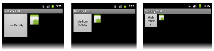
Maintaining density independence is important because, without it, a UI element (such as a button) appears physically larger on a low density screen and smaller on a high density screen. Such density-related size changes can cause problems in your application layout and usability. Figures 2 and 3 show the difference between an application when it does not provide density independence and when it does, respectively.
维护逻辑密度非常重要因为没有它UI元素(如一个按钮)低密度的屏幕上变大,在高密度的屏幕上变小,这些密度相关的尺寸变化可以导致你应用程序布局和可用性出现变化。图2和图3展示当一个应用程序没有提供逻辑密度和提供逻辑密度的不同。
drawable/?are the default drawable resources. The system assumes that default resources are designed for the baseline screen size and density, which is a normal screen size and a medium density. As such, the system scales default density resources up for high-density screens and down for low-density screens, as appropriate.
However, when the system is looking for a density-specific resource and does not find it in the density-specific directory, it won't always use the default resources. The system may instead use one of the other density-specific resources in order to provide better results when scaling. For example, when looking for a low-density resource and it is not available, the system prefers to scale-down the high-density version of the resource, because the system can easily scale a high-density resource down to low-density by a factor of 0.5, with fewer artifacts, compared to scaling a medium-density resource by a factor of 0.75.
1.基于当前系统的尺寸和密度系统会选择适当的资源,系统会用应用程序提供任何指定尺寸和指定密度的文件。例如如果设备有高密度并且应用程序需要图片资源,系统会寻找和屏幕配置相匹配的资源文件。依赖其他可用资源,一个名字包括hdpi的资源文件夹(例如drawable-hdpi),可能会更好的匹配,所以系统会直接用这些文件夹。
2.如果没有匹配的资源可用,系统用默认的资源或者是根据当前屏幕配置进行缩放。默认的资源是没有配置符的,例如
drawable/?的资源是默认资源。系统假定默认的资源是为标准屏幕尺寸和密度设计,标准屏幕尺寸和密度是中级尺寸和中级密度。系统会缩放资源为不同的屏幕配置。然而,当系系统在没有找到指定密度的文件夹时,它不会总是用默认资源。当缩放时系统为了提供更好的结果,也许系统会使用其他的密度的资源。例如当寻找低密度的资源但没找到时,系统更喜欢缩小高密度的资源,因为系统能轻易的按照0.5的比例缩小高密度资源为低密度资源,能轻易的按照0.75的比例缩小高密度资源为中密度资源。
For more information about how Android selects alternative resources by matching configuration qualifiers to the device configuration, read?How Android Finds the Best-matching Resource.
关于Android通过配置符来选择资源匹配设备配置的更多内容请看?How Android Finds the Best-matching Resource.
Using configuration qualifiers
用配置符
Android supports several configuration qualifiers that allow you to control how the system selects your alternative resources based on the characteristics of the current device screen. A configuration qualifier is a string that you can append to a resource directory in your Android project and specifies the configuration for which the resources inside are designed.
To use a configuration qualifier:
Android支持一些配置符,这些配置符通会让系统根据不同的屏幕选择不同的资源。配置符是一个字符串,这个字符串跟在资源文件夹名称的后面,为预先设计的资源指定配置。
用这些配置符可以做:
- Create a new directory in your project's?
res/?directory and name it using the format:<resources_name>-<qualifier><resources_name>?is the standard resource name (such as?drawable?or?layout).<qualifier>?is a configuration qualifier from table 1, below, specifying the screen configuration for which these resources are to be used (such as?hdpi?or?xlarge).You can use more than one?
<qualifier>?at a time—simply separate each qualifier with a dash.- Save the appropriate configuration-specific resources in this new directory. The resource files must be named exactly the same as the default resource files.
1.在你的工程?
res/?目录下创建一个新的文件夹并且用<resources_name>-<qualifier>格式命名。<resources_name>是标准资源名字(如
drawable?或?layout)<qualifier>是一个配置符从下面表1看,指定不同屏幕配置用的资源。
For example,?
xlarge?is a configuration qualifier for extra large screens. When you append this string to a resource directory name (such as?layout-xlarge), it indicates to the system that these resources are to be used on devices that have an extra large screen.?例如,xlarge是巨屏的配置符,当你在资源文件夹的名字后面xlarge(例如layout-xlarge)时,它告诉系统这个资源文件是为巨屏的设备准备的。
这个资源是为在中密度和高密度质检的屏幕准备的,近似于213dpi,这不认为是主要的密度分类。这几乎是为电视准备,大多数的应用不需要他,mdpi和hdpi资源足够给大多数的应用并且系统会酌情缩放他们。如果你发现必须要提供tvdpi资源,则你应该按照1.33*mdpi的比例来提供,例如中密度下100px *100px图片,则tvdpi应该是133px*133px图片。
OrientationlandResources for screens in the landscape orientation (wide aspect ratio).横屏portResources for screens in the portrait orientation (tall aspect ratio).竖屏Aspect ratiolongResources for screens that have a significantly taller or wider aspect ratio (when in portrait or landscape orientation, respectively) than the baseline screen configuration.
比标准屏幕宽高比明显的高或者宽的这样屏幕。
notlongResources for use screens that have an aspect ratio that is similar to the baseline screen configuration.
和标准屏幕配置一样的屏幕宽高比的屏幕。
larger?than the current screen, the system will not use them and your application will crash if no other resources match the device configuration (for example, if all layout resources are tagged with the?
xlarge?qualifier, but the device is a normal-size screen). For more information about how the system selects resources, read?How Android Finds the Best-matching Resource.关于如何使用资源和配置符的完整清单,请看Providing Alternative Resources。
值得注意的是,当Android系统运行时选择哪个资源,它用某种逻辑来决定最佳匹配资源。也就是这个配置符不必在所有的情况完全匹配所有的屏幕尺寸。特别是当基于尺寸和密度选择资源文件时,如果这没有更佳的匹配系统会用比当前屏幕小的设计资源给当前屏幕(例如必要的话大屏幕会用中屏幕的资源)。然而如果唯一可用的资源比当前屏幕大,系统不会用他们并且如果没有其他资源匹配设备时你的应用会崩溃(例如,如果所有的布局文件为巨屏设计,但是当前设备却是中屏幕),更多信息关于系统如何选择资源的,请读How Android Finds the Best-matching Resource.
large?or?xlarge).
The reason designing for 7" tablets is tricky when using the generalized size groups is that a 7" tablet is technically in the same group as a 5" handset (the?large?group). While these two devices are seemingly close to each other in size, the amount of space for an application's UI is significantly different, as is the style of user interaction. Thus, a 7" and 5" screen should not always use the same layout. To make it possible for you to provide different layouts for these two kinds of screens, Android now allows you to specify your layout resources based on the width and/or height that's actually available for your application's layout, specified in dp units.
第一带平板运行的是Android3.0系统,更好的定义平板布局的方式是把他们放到带xlarge配置符的文件夹中(例如,res/layout-xlarge/)。为了适应其他平板类型和7寸的屏幕平板类型,Android3.2介绍了一个新的为更多屏幕尺寸指定资源的方法。新的技术是基于你布局需要的空间总数(例如600dp宽),而不是尝试让你的布局填充广义的尺寸组(像大屏幕和巨屏)。
设计7寸屏幕复杂的原因是当用广义的尺寸组是技术上7寸平板和5寸的手机用相同的尺寸组(巨屏组)。同时这两个设备在尺寸上比较接近,作为用户互动的方式对于应用程序的UI所用的空间是明显不同的。因此7寸和5寸屏幕应该用不同的布局,为了为这两种屏幕提供不同的布局成为可能,Android现在允许你用dp单位指定你布局文件在屏幕上可用的的宽或高。
For example, after you've designed the layout you want to use for tablet-style devices, you might determine that the layout stops working well when the screen is less than 600dp wide. This threshold thus becomes the minimum size that you require for your tablet layout. As such, you can now specify that these layout resources should be used only when there is at least 600dp of width available for your application's UI.
例如,在你为平板设备提供设计布局后,你可决定在小于600dp的屏幕上停止使用这个布局。这个限制因此变成你平板布局的最小尺寸。在这种情况下,你能现在指定这些布局资源应该被用在至少是600dp宽的应用布局上。
You should either pick a width and design to it as your minimum size, or test what is the smallest width your layout supports once it's complete.
你应该选择一个宽度设计作为你的最小尺寸,或者一旦设计完成测试你布局支持的最小宽度。
<N>?dps of width available for it UI.
For example, if your layout requires that its smallest dimension of screen area be at least 600 dp at all times, then you can use this qualifer to create the layout resources,?
res/layout-sw600dp/. The system will use these resources only when the smallest dimension of available screen is at least 600dp, regardless of whether the 600dp side is the user-perceived height or width. The smallestWidth is a fixed screen size characteristic of the device;the device's smallestWidth does not change when the screen's orientation changes.屏幕的基础尺寸,就像可用屏幕区域的最短尺寸,尤其是设备的最小宽度是屏幕可用高度或宽度的最短尺寸(你可能会想它是屏幕最小可能宽度)。你能用这个标识符确保,无论屏幕的当前方向,你的应用程序宽度至少有<N>dps可用。例如,如果你的布局需要屏幕区域上的最小尺寸在任何时候至少是600dp,则你能用这个标识符创建布局资源res/layout-sw600dp/只有当屏幕的最小宽度是600dp时系统才会用这些资源文件,无论600dp是用户认为的宽或高。最小屏幕宽度是固定的设备特有的屏幕尺寸;当屏幕的方向改变时设备的最小宽度不变。
The smallestWidth of a device takes into account screen decorations and system UI. For example, if the device has some persistent UI elements on the screen that account for space along the axis of the smallestWidth, the system declares the smallestWidth to be smaller than the actual screen size, because those are screen pixels not available for your UI.
设备的最小宽度要考虑屏幕的尺寸和系统UI,例如,如果在屏幕上设备有一些持久化UI元素沿着最小宽度轴线计算空间,系统声明的最小宽度会比实际的屏幕尺寸小,因为这些屏幕像素对于UI来说不可用。
This is an alternative to the generalized screen size qualifiers (small, normal, large, xlarge) that allows you to define a discrete number for the effective size available for your UI. Using smallestWidth to determine the general screen size is useful because width is often the driving factor in designing a layout. A UI will often scroll vertically, but have fairly hard constraints on the minimum space it needs horizontally. The available width is also the key factor in determining whether to use a one-pane layout for handsets or multi-pane layout for tablets. Thus, you likely care most about what the smallest possible width will be on each device.
这个关于广义的屏幕尺寸标识符(小,中,大,巨大)为有效的尺寸允许你定义一个连续的数字。用最小的宽度决定广义屏幕尺寸是有用的因为宽度经常做除数在布局设计时。一个UI会经常垂直滚动,但是在水平方向上会适应的硬件约束需要的最小空间。可用宽度是决定为手机用一个布局关键因素,还是为平板用多个布局,因此,你关心每个设备上的最小宽度。
Available screen widthw<N>dp
Examples:w720dpw1024dpSpecifies a minimum available width in dp units at which the resources should be used—defined by the?
<N>?value. The system's corresponding value for the width changes when the screen's orientation switches between landscape and portrait to reflect the current actual width that's available for your UI.This is often useful to determine whether to use a multi-pane layout, because even on a tablet device, you often won't want the same multi-pane layout for portrait orientation as you do for landscape. Thus, you can use this to specify the minimum width required for the layout, instead of using both the screen size and orientation qualifiers together.
Available screen heighth<N>dp
Examples:h720dph1024dp
etc.Specifies a minimum screen height in dp units at which the resources should be used—defined by the?
<N>?value. The system's corresponding value for the height changes when the screen's orientation switches between landscape and portrait to reflect the current actual height that's available for your UI.Using this to define the height required by your layout is useful in the same way as?
w<N>dp?is for defining the required width, instead of using both the screen size and orientation qualifiers. However, most apps won't need this qualifier, considering that UIs often scroll vertically and are thus more flexible with how much height is available, whereas the width is more rigid.?
- Create a new directory in your project's?
